YACONTEE Brand Guideline
亞卡黎|視覺識別系統規範篇
2021年
Client:
YACONTEE 亞卡黎
YACONTEE is a professional agent and producer brand of aerial work platform machinery in Shanghai, China. Over the years, the company has developed into an integrated service provider of R&D, distribution, sales and maintenance, providing reliable and up-to-date products that are trusted by all industries.
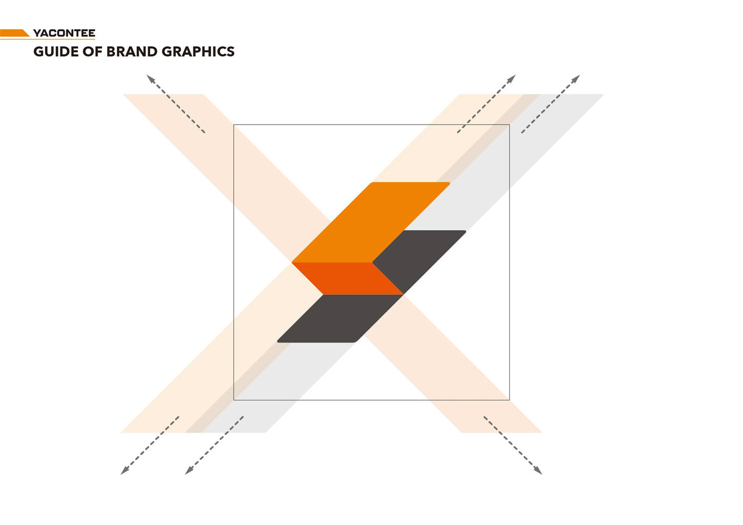
On the occasion of its 15th anniversary, OCTOSHIP is honored to cooperate with it to start the rebranding. Based on the deep-rooted corporate orange color, the Y symbol is combined with the concept of folding arms to create a logomark that is refreshing yet perfectly inherits the brand spirit.
-
Brand Guideline
亞卡黎是位於中國上海的一家專營設計及代理高空作業平台機械的企業。多年的發展下已成為研發、代理、銷售及維修的整合服務,提供各行業信賴可靠且與歐美同步的產品。十五週年之際,八號飛船榮幸與其合作展開品牌再造。以深耕人心的企業橘色為根基,讓Y字意象結合折疊手臂的概念,創造令人耳目一新卻又完美繼承品牌精神的品牌標誌。
規範篇為展示品牌的基本資訊。

Design - OCTOSHIP design
Art Director - Johnson Xie
Lead Designer - Ching Chen
Designer - Baily Bai, Wan-Zhen Lyu
【企業識別】/工業/品牌設計/高空機械/中國企業/代理商/企業識別/CIS/高空作業/機械/施工/LOGO/中英文標準字/標誌/商標/組合規範/文字規範/輔助圖形/色彩組合/VI
exclusive cooperation / corporate identity design / visual brand identity / logomark design / logotype design / brand colors


